Kia Global
Client
Kia Global
Year
2021
Scope
Platform redesign, UX, UI
Overview
Since their recent rebrand, Kia looked to revamp their platform ecosystem to match its new brand direction. The rollout starts off with its South Korean and Australian markets before implementing it in the rest of the markets globally.
Details
We the team at MediaMonks were tasked to revamp the Kia ecosystem to echo their new brand direction. The brief was to work in modular design where they can adapt for different markets as needed. In order to tackle that challenge, each page was reworked into templates and each section into components so the respective markets could tailor them for relevancy.
Role
As a part of the core team seeing this project through, I had the pleasure of working as one of the core UX designers. In this process, we started off by setting the foundation for tackling the build. I looked into direct and non-direct competitor research as well as trend mapping across components for a discovery report. The team also conducted a user survey and mapped personas to make sure we were focusing on the right problems.
Afterwards, I moved into designing wireframes and interactions for page templates and components. The team made a total of 92 final templates, not including iterations! Part of my job scope was to also bridge the gap with the developers on JIRA and confluence, explaining functions and interactions. Finally, my duties also include walking the clients through our wireframes and helping them understand our design decisions.
Kia.com is commerce-first; weaving stories through a personalised journey. Intuitive and simple controls help consumers find their perfect vehicle, through both customisation and sensorial moments.
UX foundation
We conducted a user survey of 50 people all over South Korea and Australia to further understand their needs when it comes to car purchasing journeys.
After analysing the data, we collected many behavioural insights to understand what users need and how we can best convey information. We were able to shape four user mindsets based on customer behaviours and psychographics. In addition, we created six key experience principles that were common themes across all user groups.
Thanks to our research findings, we were able to uncover key principles and archetypes that would be used to fuel our user experience design on the site.
Competitor benchmarking
Discovery report
Persona archetypes
Six key user findings
IA Overview
IA breakdown
Visual
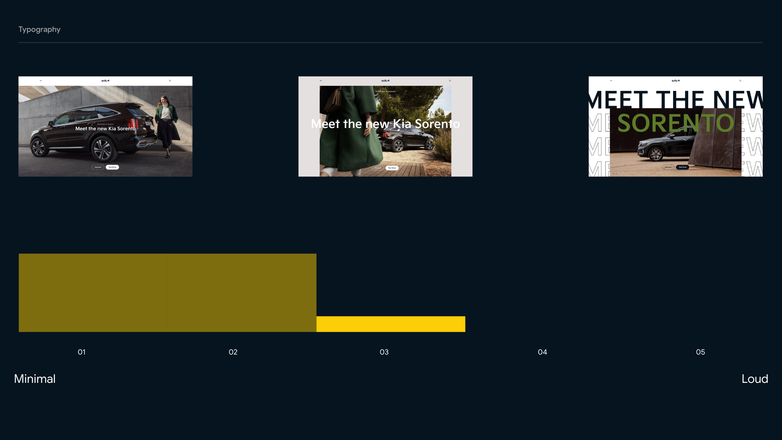
We also conducted a visual language workshop with the clients to find out where they are at in terms of the new brand direction. The results of this research helped us better understand where their comfort levels lie and how much we can push or work around the existing perimeters.
New Kia brand guide
Results of internal workshop with clients
Results of internal workshop with clients
Wireframes to visualisation
Home page (wire): As users land on the page, we wanted to encourage exploration and entice them with the latest offers through natural language exploration. Click on the image to see more!
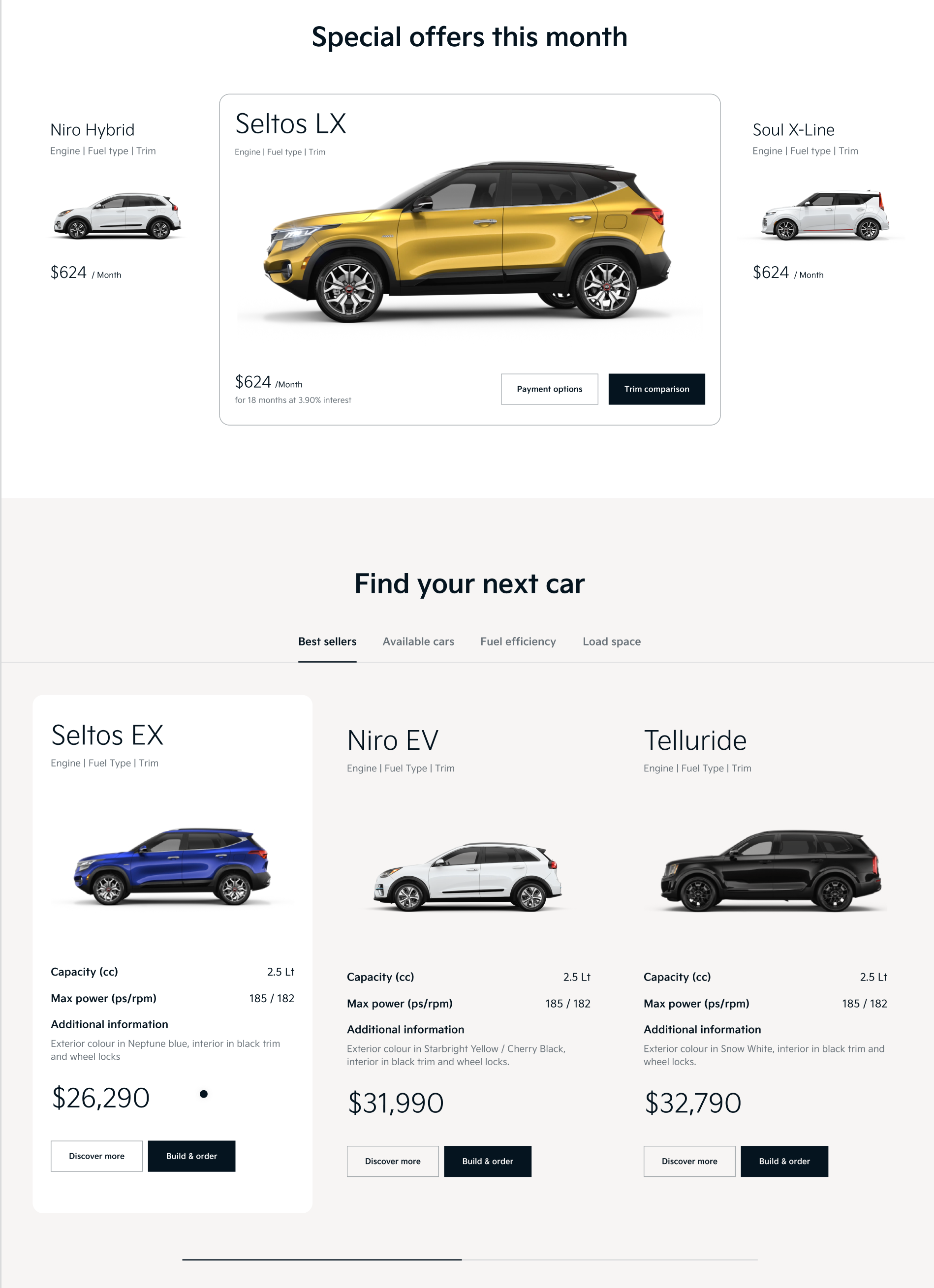
Home page (visual): Users can click on different tabs to find something suitable for them. Click on the image to see more!
Car comparison (wire): For the compare vehicle template, we had the task of solving for multi-vehicle search that included non-Kia vehicles. My favourite function was the nifty frequently compared section where the realisation lies in the fact that people already want to compare with other brands of cars. This also showcases the faith the brand has in the product they put out.
Car comparison (visual): Through iteration, the function remains largely the same with the exception of content to highlight and the number of columns available to compare was brought down to three to keep the users focused on the task.
Reserve a service (wire): Booking a servicing online can be quite painful with users often times not being sure how to find or have forgotten the information. We only require the most important information from our users without increasing friction towards booking a service. We also have visual aids to help them gauge how much of the process is left. Provided is also an open text field that users can give us more details on what they need help with that might not fit into the standard issue.
Reserve a service (visual): Through iterations, we've been able to refine the solution from tabs to accordians. A tab system might suggest to users that each step are mutually exclusive and they can jump around. On the other hand, the sequetial flow of accordians clearly guides the user through sections of the page with future sections not being clickable at all, all while glancing the information they have set the steps before.
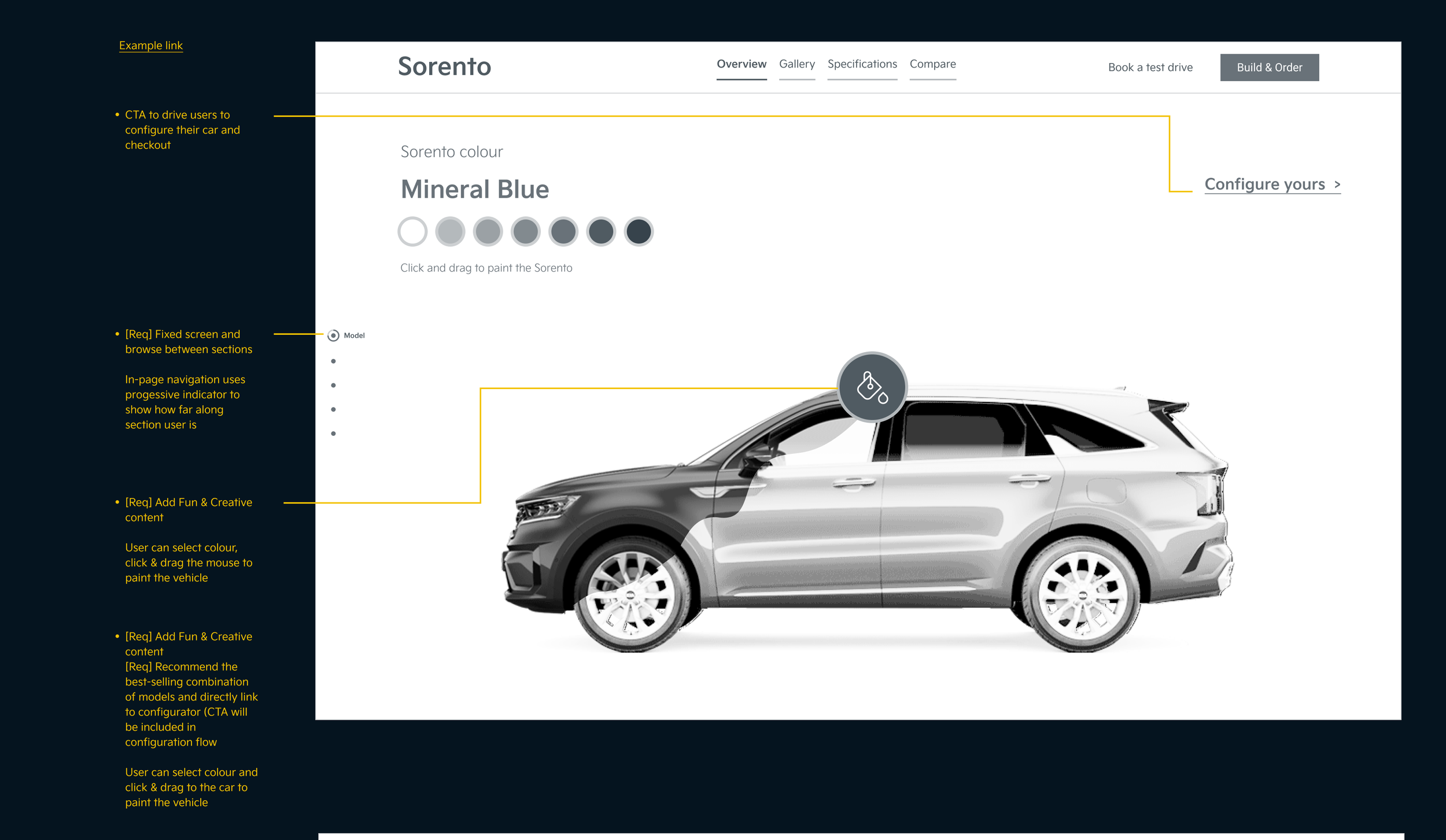
Wireframe I made and liked but were rejected: I wanted to inject a little more fun into an otherwise stagnant process of colour picking. Users can select a colour and drag and drop it onto the car to switch it up. A little paint pouring action further amplifies the play and exploration of the product.
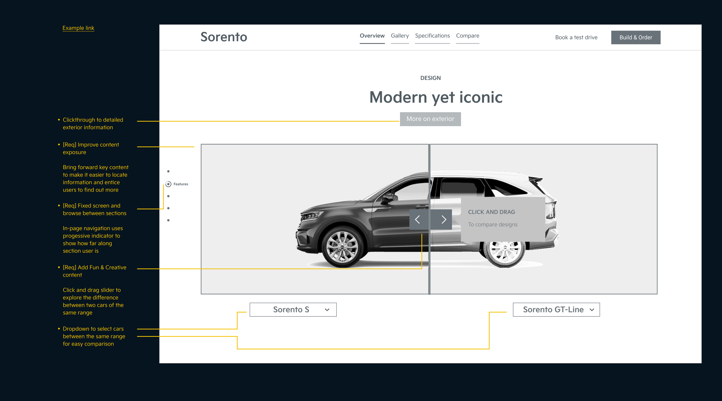
Wireframe I made and liked but were rejected: Oftentimes when viewing two variations of the same product, I find myself switching back and forth to find out if the premium is worth the bargain. This little module explores that idea by comparing the basic model and the premium model. By comparing the two, we provide a little moment to entice the users to consider the premium by showing them what they might be missing out on.


